Overview
Nacelle's design team has gone through 2 major transitions in the last 3 years. Our focus here is on the latest shift that began at the end of 2021 when the expansion of new features was set to be implemented in the coming months, alongside branding as an initiative for Marketing and the creation of a design system set out to complete faster prototypes and mocks for our developers.
Role
Product Designer
User Research, Mind mapping, Design System implementation, Wireframing, Hi-fi Prototyping, Interactions, and Dev Handoff coordination and collaboration
June 2020 - Ongoing
About Nacelle
Nacelle is a platform built for technology leaders, eCommerce developers, and innovators. In the world of eCommerce, D2C/B2c, backend infrastructures have disrupted hundreds of thousands of companies in regards to their in-the-box tech stacks, building and maintaining custom servers and DevOp solutions, and in general slow performing front-ends for customers. Nacelle's mission is to fuel merchant growth by orchestrating data without limitation by increasing GMV & AOV, boosting site speed and quickly building unique shopping experiences.
Design Org Structure
Design Lead: CJ Weatherford
Product Designer: Me 🙋🏽♀️
Product Designer: Me 🙋🏽♀️
That's it. We are a 2-person team alongside a sea of developers throughout different squads, our product leads, and managers.
Competitive Analysis
In 2020, there were no major competitors of our kind. A handful of companies coined themselves as "headless," "composable," or commonly termed their mission of "separating the front-end from the back-end." However, the solution of our competitors was still monolith-like and required the use of their front-end platform. As a differentiator, Nacelle's platform focuses more on data ingestion and is positioned as the orchestration layer of your front-end/back-end and tech stack. With that in mind, there are plentiful platforms that ingest data, store, and syndicate data and use the collected data on a dashboard as the source of truth.
Out with the Old 👋🏼
Understanding the Business Needs & Objectives
Early on, during the creation of Nacelle, engineers were the backbone of the product. Developing solutions for data ingesting, and architecting and designing a multi-tenant system, streamlining how data flows, data structures, indexing systems, and APIs, there was zero design in mind for the end-users implementing the use of the dashboard.
"With faster launch of MVP comes greater design challenges."
With that in mind, Design was introduced and our main objective was for us to improve all aspects of the current dashboard, by relieving pain points, understanding and providing empathy for our users, and considering future features and initiatives. And from there on, we began the redesign process.
Our Process
Design System
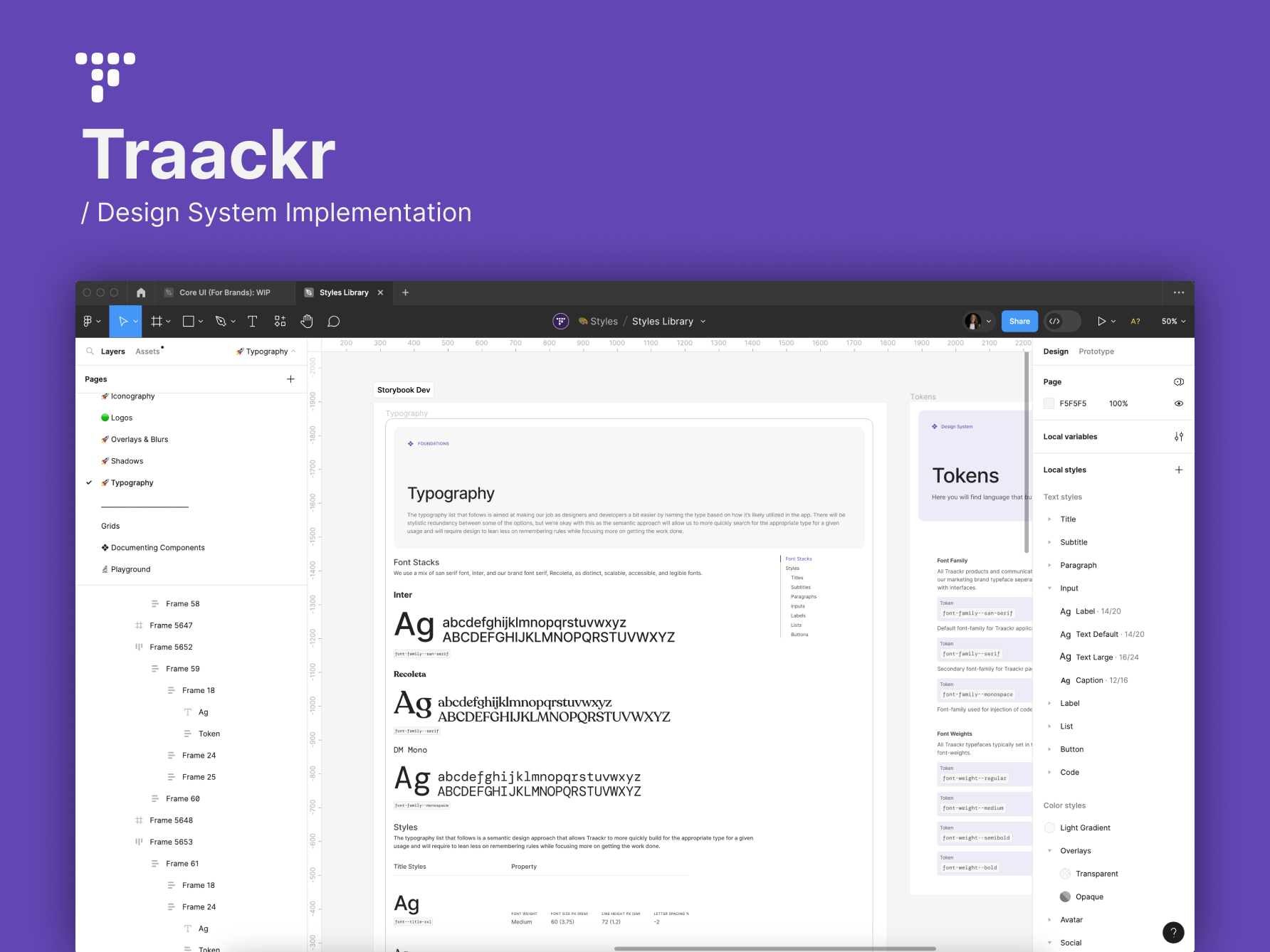
Introducing Atomic Design to Nacelle's design system: Uhura Holodeck 🎉
Base (Styles)
We first began with Base components: Colors, Typography, Iconography, Grids/Spacing, and Shadows/Blurs as these establish the visual consistency of our components. Our colors and typography are an extension of the brand. We lean heavily into the methodology of Minimum Viable (we like Valuable) Product and at the core, we wanted the DS to provide the most valuable components of the visual brand.
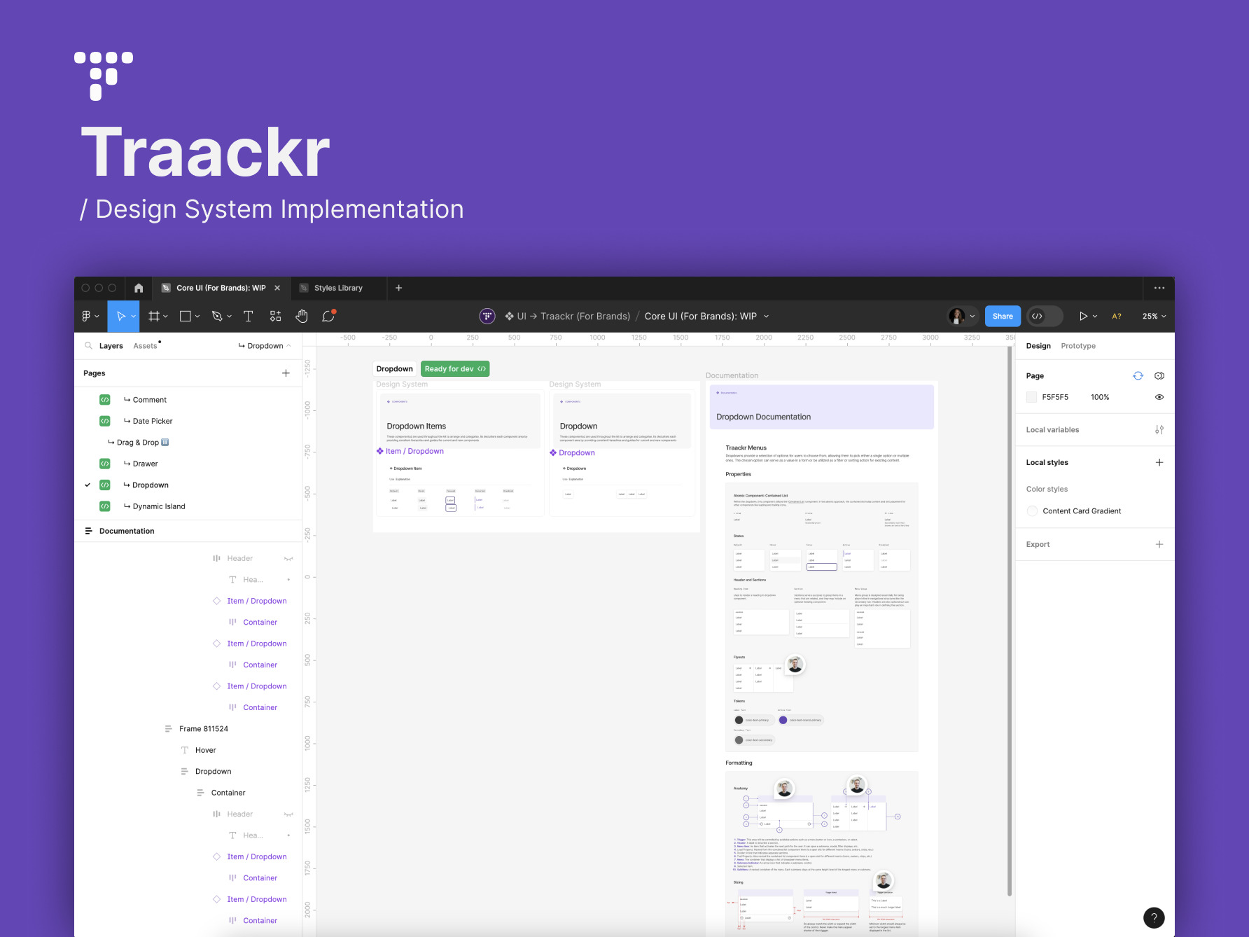
Atoms (Foundations), Molecules (Structures), Organisms (Recipes)
Continued iteration has occurred. As more features become available, the design system grows and through this approach, we can easily create consistency and deliver quick hi-fi prototypes to the engineers.
Interviewing Key Users (Feature/Initiative Specific)
Note: Here's what we will focus on for the rest of this case study as to what I believe was the most valuable and impactful part of the redesign. Although, there were many more objectives and goals in the redesign of Nacelle's dashboard.
Navigation Feature
Question Snippet:
Question 1: What is the biggest pain point related to the Navigation/Link List feature?
Question 2: What problems do you face when you have a handful of menu lists?
Question 3: Can you walk me through the first time you used the Link Lists feature?
As you may notice from the screenshot above, this feature was one of the biggest pain points our users both external and internal explained over and over. We discovered from our interview questions that:
1. More often than not, a menu system can range from simple few items to a handful of strategically structured systems navigating our user's customers on their storefront. Thus, the long form of each menu item and its submenu items, lackluster the ability to even use the feature.
1. More often than not, a menu system can range from simple few items to a handful of strategically structured systems navigating our user's customers on their storefront. Thus, the long form of each menu item and its submenu items, lackluster the ability to even use the feature.
2. The interaction to drag-and-drop or embed items, was chaotic and unfortunately undesirable and set a user to have to manually one by one add the correct order of the menus. This causes complete frustration when a user needed to update a future iteration of their navigation.
3. Navigation items required more properties, like media and that was currently missing.
Platform Navigational Structure
Question Snippet:
Question 1: Walk me through setting up multiple spaces in different organizations?
Question 2: What are the business goals for onboarding enterprise and internationalized companies?
Question 3: Can you describe your experience navigating space to space?
When the structure of the dashboard was created, there was no consideration in IA or strategy of the navigational hierarchy of Nacelle's platform. Through our research, we found that the horizontal navigation was interfering with the overall flow. As you can see from the image above, there are 3 navigation structures in place. The left drawer > Horizontal Tabs > Vertical Tabs (Indices Types). This needed simplified!
JTBD
After listening to our users, we begin to understand their desires and what our users want to achieve. The Jobs To Be Done method gave design and product high-level tasks to strategize later in user flows and wireframes. Here are a few statements that put us on the right track.
Navigation Feature:
1. When I have a large menu catalog, I want to add items through my own process, so that I am not boxed into an exact execution of items line by line.
2. When I create a new space, I want directly duplicate navigation from a current space to a second space, so that I can quickly display the same navigation structure.
Platform Navigational Structure:
1. When I join Nacelle, I want to jump between my organizations and/or spaces, so that I can easily access data from one place to another.
2. When I am onboarding a new space, I want to quickly access settings, so that I can set up my space with ease.
3. When I am viewing the dashboard, I want to immediately know the Space ID, so that I can reference each space on the backend and other areas as needed.
Conducting Maze Surveys and User Feedback
Navigation: At times, we devised multiple flows defining success for a feature. So we took the time to A/B test and conduct surveys and received feedback from our users. You can view the Maze reports by clicking each image.
Iterate and Re-Iterate Again and Again!
In this specific feature for transferring navigation, we found verbiage "Transfer Navigation" didn't translate as well. Which advised us to be more literal and change the button to "Import/Export Navigation."
Overall Navigation feature had many aspects to improve and defining, designing, and validating processes continued:
1. Improve interactions
2. Create ease for large catalogs
3. Improve language and structure
4. Add a new metafield feature for each Menu Group, Its Lists, and Subsets.
5. Visualize properties in each menu item (i.e. image, type, properties included or not)
1. Improve interactions
2. Create ease for large catalogs
3. Improve language and structure
4. Add a new metafield feature for each Menu Group, Its Lists, and Subsets.
5. Visualize properties in each menu item (i.e. image, type, properties included or not)
Sitting with Our Platforms Navigation- holistically.
Feedback Approval
We delivered a beta phase to a few select merchants and internal CX members to use for the next few days and gave them actionable tasks to collect qualitative data as focus groups to navigate around the new layout.
1. Internal member: Set up a new space and connect your first connector.
2. Merchant with multiple spaces: Collect your API details from space x and space x.
1. Internal member: Set up a new space and connect your first connector.
2. Merchant with multiple spaces: Collect your API details from space x and space x.
Overall we found bringing out the important elements and features of each space and creating dropdowns per organization and space gave our users quicker reactions to move about, and find without questions. Jumping from space to space without having to retrieve a "home page" effectively helped them get their tasks done faster.
Keeping up with the Changes

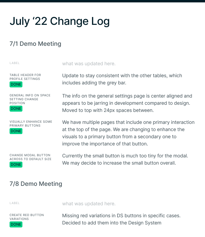
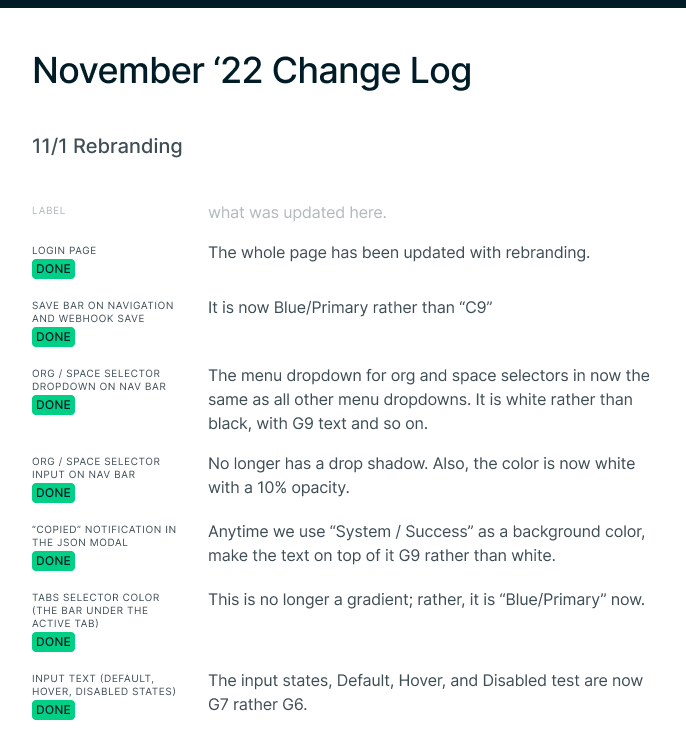
Developer Communication and Organization
I pride myself in project management and the skillset to stay on top of organizing that clearly and effectively helps the business, design, and our important counterparts to successfully launch the product, the Engineers and Front-End Developers. During my tenure at Nacelle, I advised and created file organization, Figma structure for sandboxing, iterating, and sharing internally.
Insert Figma project layout.
In with the New 🎉
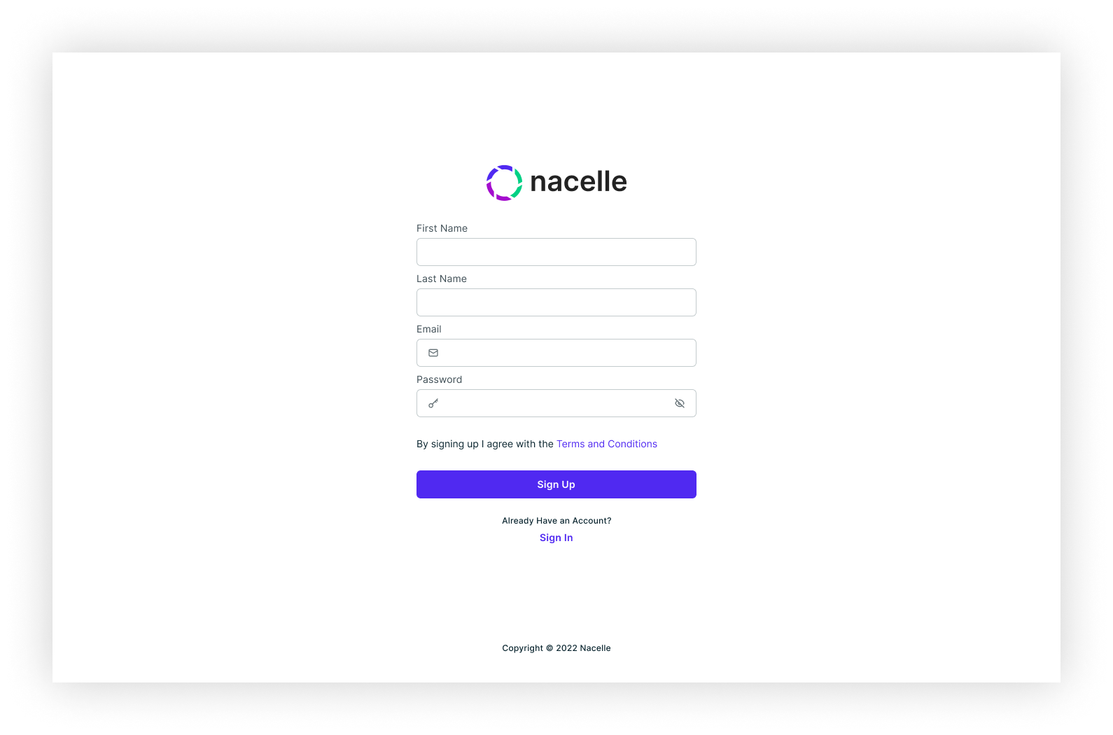
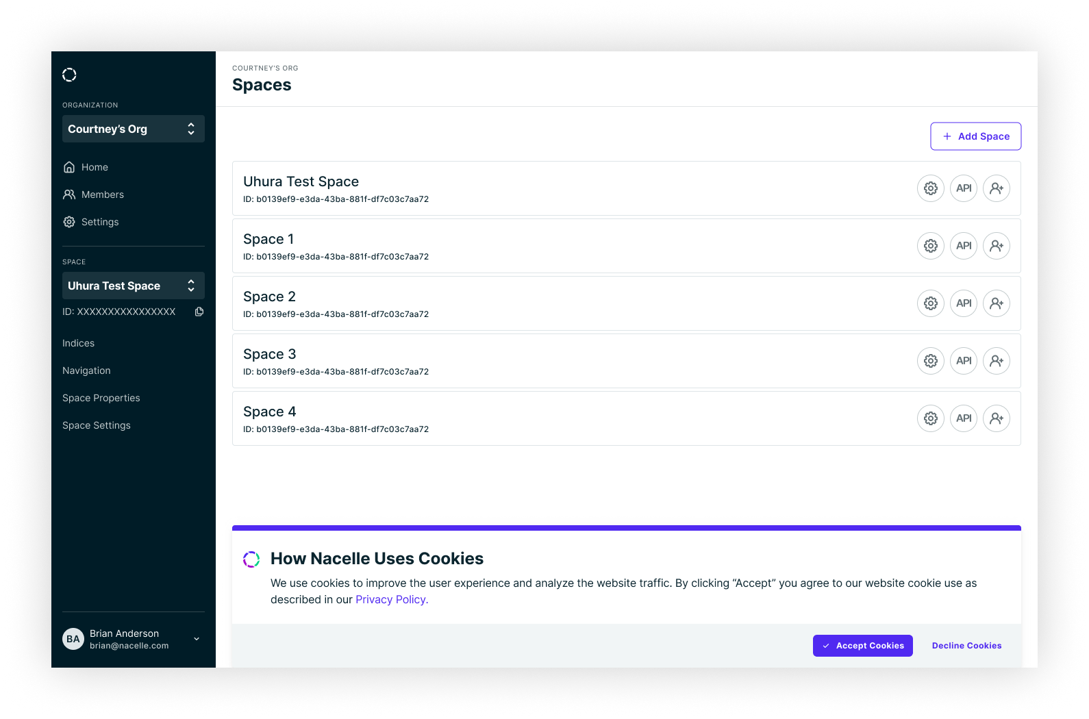
If you have the time, here is a full walk-through with explanations to our internal team.
Note: This was before the change of brand colors that you have been seeing above.
As you may notice, there was a huge switch in the design of Nacelle, many current features were redesigned and new features were introduced. Here is a list of what's involved but not described in the redesign process above:
1. Onboarding
2. Revamped messaging
1. Onboarding
2. Revamped messaging
3. Error handling
4. Extension of profile account, space, and org settings
5. Slack notifications
5. Slack notifications
6. User invites, roles, and permissions
7. Transfer organization ownership
8. Indice details page and JSON organization
9. Delete services
10. Auth0 integration
11. Email Invite
12. Space Properties revisioned
